How to Create Heat Map: A Step-by-Step Guide for Real Estate
Learn how to create a heat map to visualize real estate data. Our guide explains how to create heat map visuals that boost client insights and decision-making.
By James Le
When you’re making a heat map, you're essentially taking raw geographic data, plugging it into a generator tool, and visualizing key metrics like property prices. The goal is to turn a dense spreadsheet into a clear, color-coded story that clients can grasp in seconds.
Why Heat Maps Are a Game-Changer for Real Estate Decisions

Before we get into the how, let’s talk about the why. A heat map isn't just a pretty graphic. It’s a powerful way to translate abstract data into tangible real estate intelligence. It’s the difference between telling your clients about the market and actually showing them.
Think about it. You could try to explain neighborhood price fluctuations with a spreadsheet full of numbers. Or, you could pull up a map where bright red spots instantly flag the priciest blocks, while cooler blue and green zones highlight potential investment opportunities. The second approach builds immediate trust and clarity.
The Competitive Edge of Seeing the Data
In the real world, agents lean on heat maps to get a serious leg up on the competition. Here’s how:
- Spot Undervalued Pockets: By layering average sale prices over data like school ratings or new amenities, you can uncover neighborhoods with huge potential that are still flying under the radar.
- Back Up Your Pricing Strategy: When you’re listing a home, a heat map showing recent comps in the immediate area is undeniable proof that your recommended price is on the money.
- Make Complex Trends Simple: A single map can illustrate months of market shifts, showing clients exactly where demand is heating up or cooling off without drowning them in stats.
This isn't just a niche tactic anymore. The global market for heatmap tools hit USD 476.2 million in 2022 and is expected to climb to USD 1,267.9 million by 2030. That explosion in growth tells you everything you need to know about the demand for data-driven insights. You can dig into the numbers yourself in this market research report.
When you turn raw data into a visual story, you empower clients to make faster, more confident decisions. That not only makes your job easier but also cements your reputation as the go-to expert who truly knows the market.
Finding and Preparing Your Property Data

Let's be clear: a heat map is only as good as the data you feed it. Garbage in, garbage out. Before you can dream of visualizing market trends, you need to get your hands dirty sourcing and structuring the right information.
Honestly, this is the most critical part of the entire process. Nail this, and the visualization almost builds itself.
Where to Actually Get the Data
The good news is that valuable real estate data is everywhere these days, from free public records to hyper-specific paid services. You just need to know where to look.
Your first stop should be free, public resources. Most city and county governments run open data portals where you can pull property tax records, sales histories, and zoning info. For a local analysis, this is often more than enough to get started.
If you need deeper, broader, or just cleaner data, you might look at specialized real estate APIs or dedicated data providers. Yes, they cost money, but they can save you dozens of hours of cleanup work.
Pro Tip: Don't forget the goldmine you're already sitting on—your local MLS. It's the most up-to-date source for comps, days on market, and list-to-sale price ratios in your immediate market.
To give you a better idea of what's out there, here’s a quick breakdown of common data sources.
Essential Real Estate Data Sources
| Data Type | Public Source Examples | Paid/Subscription Source Examples |
|---|---|---|
| Property Sales History | County Recorder/Assessor's Office | CoreLogic, ATTOM Data Solutions |
| Property Tax/Assessment | City/County Tax Assessor's Website | Black Knight, PropertyShark |
| Demographics (Population, Income) | U.S. Census Bureau | Esri, Nielsen |
| School Ratings & Boundaries | National Center for Education Statistics | GreatSchools.org (API), Niche |
| Crime Statistics | Local Police Department Portals | CrimeMapping.com, ADT |
| Zoning & Land Use | Municipal Planning Department | Zoneomics, Local GIS Services |
Getting a feel for these sources is key. You'll quickly learn which ones are most reliable for your specific needs and geographic area.
Getting Your Data Ready for the Map
At a bare minimum, every property record in your file needs two things: a location and a value. Your entire goal here is to get this info into a simple, clean spreadsheet.
- Location Data: This needs to be a full, consistently formatted address (e.g., "123 Main St, Anytown, USA") or precise latitude and longitude coordinates. Consistency is everything.
- Value Metric: This is the number that will drive the "heat" on your map. It could be sale price, price per square foot, rental yield, or even the number of days on market.
Once you’ve gathered your data, drop it into a CSV or Excel file with dead-simple column headers like "Address," "City," "State," "ZIP," and "SalePrice." This clean, predictable format is what allows mapping tools to read your data correctly.
If you want to dive deeper into data organization best practices, the Tab Tab Labs resources section has a ton of great guides.
Okay, you've got your data wrangled and ready to go. Now comes the fun part: picking the right tool to actually build your heat map.
Honestly, the market is flooded with options. The trick to knowing how to create a heat map that’s actually useful is choosing software that fits what you need without giving you a headache. It's a classic balancing act between usability, features, and cost. You don't need a PhD in cartography to do this; a straightforward tool often beats a complicated one.
Key Criteria for Selection
I find it helps to focus on three big questions when looking at mapping tools. First, how easy is it to get my data in? A simple drag-and-drop for your spreadsheet is a huge win over something that makes you jump through technical hoops. Second, what can I do with it once it's there? You need to be able to tweak the colors, adjust the "heat" radius, and play with the intensity to really tell a clear story.
Finally, what's the damage? While some high-end tools are fantastic, there are plenty of free platforms that are more than powerful enough for creating killer property maps. This little diagram breaks down that decision process.
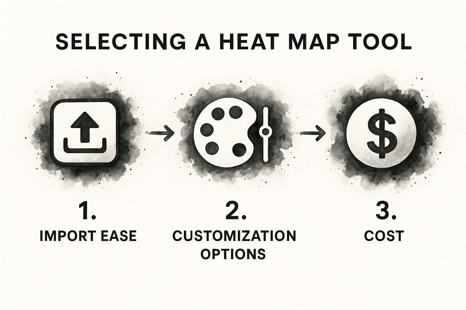
Think of it as a simple gut check to make sure you’re picking a tool that works for you, not the other way around.
Comparing Popular Mapping Tools
For quick-and-dirty visualizations, Google My Maps is a fantastic place to start. It’s free, dead simple to use, and you can import a basic spreadsheet in seconds. If you need to whip up a simple map showing property prices for a client presentation, you can get it done in minutes.
But what if you need to go deeper? That's where a tool like Tableau Public comes in. Yes, there's a bit of a learning curve, but the payoff is huge. You get the power to layer different data sets and build interactive dashboards that tell a much richer story. Imagine mapping property values and then overlaying school district ratings and crime data all at once. That's the kind of insight that sets you apart.
Your ideal tool is one that makes data visualization feel empowering, not intimidating. Start simple, and only move to more complex software when your analytical questions demand it.
If you want to see what else is out there, this curated list of real estate agent tools is a great resource. It covers a bunch of different platforms, many designed specifically for real estate pros.
Building Your First Real Estate Heat Map

Alright, your data is clean and ready to go. Now for the fun part: actually bringing your map to life. If you're picturing a complicated, code-heavy process, don't. Modern tools make this surprisingly straightforward.
Let's walk through a classic real estate scenario. Say you want to show a client the average home sale prices across a few key neighborhoods. You’ve got a spreadsheet with columns for "Address," "Neighborhood," and "SalePrice." Using a tool like Google My Maps, your first step is to simply import that file.
The software will ask you to point it to the location data. This is where having clean data really pays off. You'll just select the "Address" column to place your markers on the map, then pick a column to title those markers—the address or neighborhood name usually works best.
Configuring Your Map's Data Layers
Once your properties pop up as individual pins, you've got a standard pin map. The real magic happens next, when you tell the software which data should drive the colors. This is the pivot from a simple pin map to an insightful heat map.
You have to define your "heat" metric. Dig into the layer style options until you find a setting to style the data by a specific column. For our example, you’d choose the "SalePrice" column. The tool instantly generates a color gradient, assigning different shades based on the prices in that column.
The core idea is simple: the software ties colors to data values. Higher sale prices might glow a hot red, while lower prices show up as a cool blue. Suddenly, market hotspots jump off the screen without anyone having to click on a single pin.
You can take it a step further, though. Customizing the visuals is what turns a good map into a great one that tells a clear story.
Adjusting Visuals for Maximum Impact
Most mapping tools give you a ton of control over the look and feel. This isn't just about making it pretty; it's about making the data so obvious that your clients get it in seconds.
Here are the key settings to play with:
- Color Gradient: Don't just accept the default colors. If a different scheme tells a better story, use it. You could use shades of green to signify "money" or growth in high-value areas.
- Radius and Intensity: These settings control how large and "hot" each data point looks. A bigger radius creates that blended, classic heat map look. A smaller radius keeps the focus tight on specific properties or blocks.
- Opacity: I like to dial back the opacity a bit. This lets the underlying street map show through, giving your client that all-important geographic context so they can see exactly where these hotspots are.
Experimenting with these options is how you transform a basic data plot into a powerful visual argument. Instead of just throwing numbers at your client, you're guiding them through a data-backed story of the local market.
And if you want to speed things up, exploring pre-designed mapping and data visualization templates can give you a professional-looking result right out of the gate. Getting these visual details right is what separates a confusing map from a persuasive sales tool.
Alright, let's get this done. A finished heat map isn't just a pretty picture; it’s a storytelling tool. Your goal isn't to dump raw data on a client but to steer their decisions with clear, actionable insights you've pulled directly from the patterns.
https://www.youtube.com/embed/VA6Ae7_6o5k
Just showing a client the default map view is a fast way to overwhelm them. The real magic happens when you tailor the visual story to what they actually need, whether they’re on the buying or selling side of the table.
Turning Data Into a Conversation
First things first, you have to frame the data.
For a buyer, I'd focus on the cooler-colored areas. These are your hidden gems—neighborhoods with high-growth potential or undervalued properties that are still close to the good stuff. For a seller, you do the opposite. You zoom in on those intense "hot spots" to back up your recommended listing price, showing them a tight cluster of strong comps right in their backyard.
But the map itself is only half the battle. Context is everything. Here’s how you add it:
- Pick the Right Colors: Stick to intuitive color schemes. A simple green-to-red gradient is perfect for pricing because everyone instantly gets it: green is lower, red is higher. No explanation needed.
- Customize Your Pop-ups: Don't just show the price when someone clicks on a property. Configure those pop-up boxes to include the good stuff: days on market, price per square foot, maybe even the school district.
- Overlay Key Landmarks: This is a game-changer. Most tools let you add layers for things like school zones, transit stops, or new commercial developments. Dropping these onto the map adds a powerful layer of real-world context that clients can immediately grasp.
This kind of focused analysis turns a simple graphic into a strategic asset. It's not just theory, either. Using AI-powered heat maps to zero in on areas of interest has been shown to boost conversion rates by up to 25% by making complex data dead simple to understand. You can dig into the numbers behind these software findings on Archive Market Research.
This is how you shift from being just another agent to becoming a trusted market advisor. When you interpret the patterns and present a clear story, you help clients make confident, data-backed decisions—and that’s what builds a career.
Common Questions About Making Heat Maps
Diving into heat maps for the first time? You're not alone. A few common questions pop up right away, and getting them sorted out from the start will save you a ton of headaches.
First up, how do you handle a massive area like an entire city? The instinct is to plot every single property, but that just creates a cluttered, slow-loading mess. Instead, think bigger. Group your data by ZIP code, neighborhood, or even census tract. This gives you a much cleaner, high-level view of what the market's actually doing.
What's the Best Free Tool to Start With?
If you're just dipping your toes in the water, Google My Maps is your best friend. It’s incredibly straightforward. You can import a spreadsheet of addresses with a data column—say, sale price—and it will generate a simple, shareable map in minutes. It nails the basics without getting complicated.
Once you're ready to tell a more detailed story with your data, check out Tableau Public. It's a seriously powerful free tool that lets you layer data and create much more sophisticated visualizations. It’s the next logical step up when you need more firepower.
A final pro tip: skip trying to build these on your phone. While some apps have mapping features, creating a proper heat map is a job for your desktop. The bigger screen and more capable software make handling the data and actually seeing the patterns a whole lot easier.